


How To Create Multi-Step Forms in Bubble: The Ultimate Guide
17th of February, 2025
By the end of this blog, you’ll learn everything there is to know about creating multi-step forms using Bubble. We will cover when and why you should use multi-step forms, how to design form elements, how to show and hide sections dynamically, how to submit the form as an entry in your database, and how to create a custom progress bar from scratch. And the best part? You won’t need to write a single line of code! So, without further ado, let’s dive into Bubble and start building.
Throughout this guide you’ll learn:
2. Designing the Multi-Step Form in Bubble
3. Implementing Custom States to Control Visibility
4. Setting Up Conditional Visibility
1. Why Use Multi-Step Forms?
Multi-step forms are incredibly useful, especially in scenarios where users need to input a lot of data. Instead of overwhelming users with long, complex forms, breaking the input process into multiple steps improves the user experience. This approach is commonly used in CRMs, registration workflows, and lead generation forms.

Traditionally, new Bubble users might create a form by spreading input fields across multiple pages and using navigation events to move between them. However, this approach leads to unnecessary page loads, a cluttered app structure, and a slow user experience.
With a multi-step form, users can move seamlessly through steps without experiencing page reloads. This creates a faster and smoother experience.
2. Designing the Multi-Step Form in Bubble
To implement a multi-step form in Bubble, we use groups instead of separate pages. Each step of the form is contained within a group, and these groups are shown or hidden as users navigate through the form.
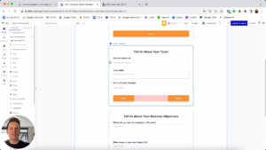
Step 1: Creating Groups
- Open your Bubble editor and create a new page.
- Add three groups (or as many steps as needed). Name them appropriately, such as:
- Group Step 1
- Group Step 2
- Group Step 3
- Ensure each group has the necessary input fields. For example:
- Step 1: Basic company details (Company Name, Contact Number, Email)
- Step 2: Team information (Team Size, Team Skills)
- Step 3: Additional details (Multi-line text fields)
Step 2: Creating Navigation Buttons
Incorporate “Next” and “Back” buttons within each group to facilitate user navigation between form steps. Ensure these buttons are clearly labeled and consistently placed to guide users through the form seamlessly. Each group should have Next and Back buttons:
- Step 1: Only a Next button
- Step 2: Back and Next buttons
- Step 3: Back and Submit buttons
Step 3: Assign Meaningful Names
Since multiple buttons will exist across the form, update their names:
- Button Next Group 1
- Button Next Group 2
- Button Back Group 2
- Button Back Group 3
- Button Submit Group 3
Naming elements properly makes it easier to configure workflows later.
3. Implementing Custom States to Control Visibility
Instead of storing form navigation data in the database, we use custom states, which are temporary variables stored on the page.
Step 1: Creating Custom States
- Click on the page element in the Bubble editor.
- Add three custom states:
- Display Group 1 (Yes/No, Default: Yes)
- Display Group 2 (Yes/No, Default: No)
- Display Group 3 (Yes/No, Default: No)
These states control which group is visible at any time.
Step 2: Building Navigation Workflows
For the Next buttons:
- When Button Next Group 1 is clicked:
- Set Display Group 1 to No
- Set Display Group 2 to Yes
- When Button Next Group 2 is clicked:
- Set Display Group 2 to No
- Set Display Group 3 to Yes
For the Back buttons:
- When Button Back Group 2 is clicked:
- Set Display Group 2 to No
- Set Display Group 1 to Yes
- When Button Back Group 3 is clicked:
- Set Display Group 3 to No
- Set Display Group 2 to Yes

4. Setting Up Conditional Visibility
By default, all groups should be hidden except for the first group.
- Select Group Step 1 and uncheck “This element is visible on page load.”
- Go to the Conditional tab and add a condition:
- “When Page’s Display Group 1 is Yes, This element is visible.”
- Repeat for Group Step 2 and Group Step 3 using their respective conditions.
Now, when users navigate, groups will show and hide dynamically.
5. Creating the Progress Bar
A progress bar helps users see their position within the form.
Step 1: Designing the Progress Bar
- Add a new Group Progress Bar at the top of the page.
- Inside this group, add:
- Three circle groups (one for each step) named Progress Circle 1, 2, 3.
- Two bar groups between them.
- Style the circles with border-radius 100% to make them round.

Step 2: Adding Conditions
- For Progress Circle 1, add a condition:
- “When Display Group 1 is Yes, background color = Orange.”
- Repeat for Progress Circle 2 and 3, updating their conditions accordingly.
- For the bar groups, use conditions to change colors when users progress.
Now, as users move through steps, the progress bar will visually update.
6. Finalizing the Form Submission
When users reach the final step and click Submit:
- Set Up Submission Workflow: Create a workflow triggered by the “Submit” button that compiles the data from all input fields across the form steps and creates a new entry in your database.
- Create a new workflow: Data -> Create a New Thing -> Lead
- Map input fields to the corresponding database fields.
- Provide User Feedback: Optionally, navigate users to a confirmation page or show an alert confirming submission of the form.
7. Conclusion
By following these steps, you’ve successfully created a multi-step form in Bubble with dynamic navigation, custom states, conditional visibility, and a progress bar. This technique enhances user experience by making data entry smoother and more intuitive.
If you found this guide helpful, stay tuned for more Bubble tutorials!